
The Washington Metropolitan Area Transit Authority (WMATA) commonly referred to as Metro, is a public transit agency that operates transit services across the Washington, DC metropolitan area.
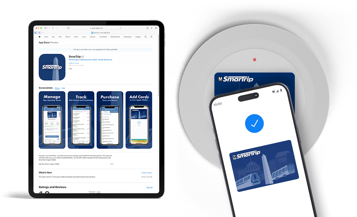
Metro needed an app store icon, revamped digital card and sample graphics for the launch of its new SmarTrip phone application, as well as some explainer videos once the app was available of both Apple and Andriod phones.
The app logo design had to work with many factors around app store requirements, useability, and be immediately recognizable as belonging to the SmarTrip brand. I went with a simplified version of the SmarTrip Logo, and the illustration of the Washington Monument from the original card artwork, to make it clearly linked to the greater DC area. It also reads a little like a metro pylon, which is a nice bonus. The simplified single color card redesign ties into the icon look , and is more legible in wallet apps than the original.